
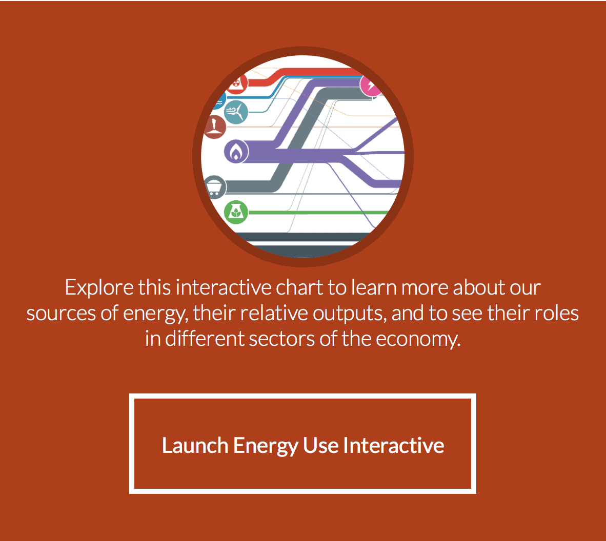
Finally, let’s take a look at overall energy production and consumption here in the United States. The following interactive chart made from a “Sankey Diagram” details the quantities of energy generated from all sources and how that energy is used by various sectors of the economy. Lawrence Livermore National Laboratory has been producing these flow charts and publishing them since the mid-1970s. Explore this diagram to help you see general trends and the complex nature and interconnectedness of energy production and consumption in the United States.
Images: “Wide Aerial View of Chicago at Night” by chrisp0 via iStock